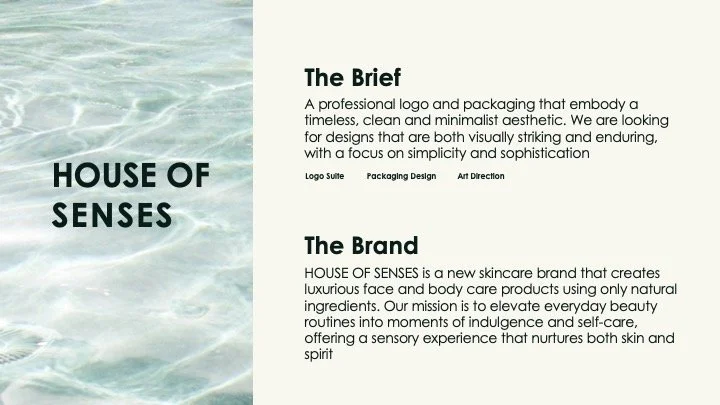
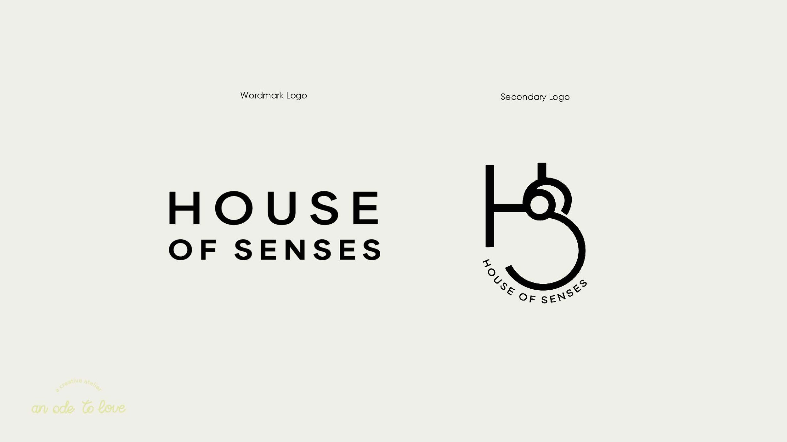
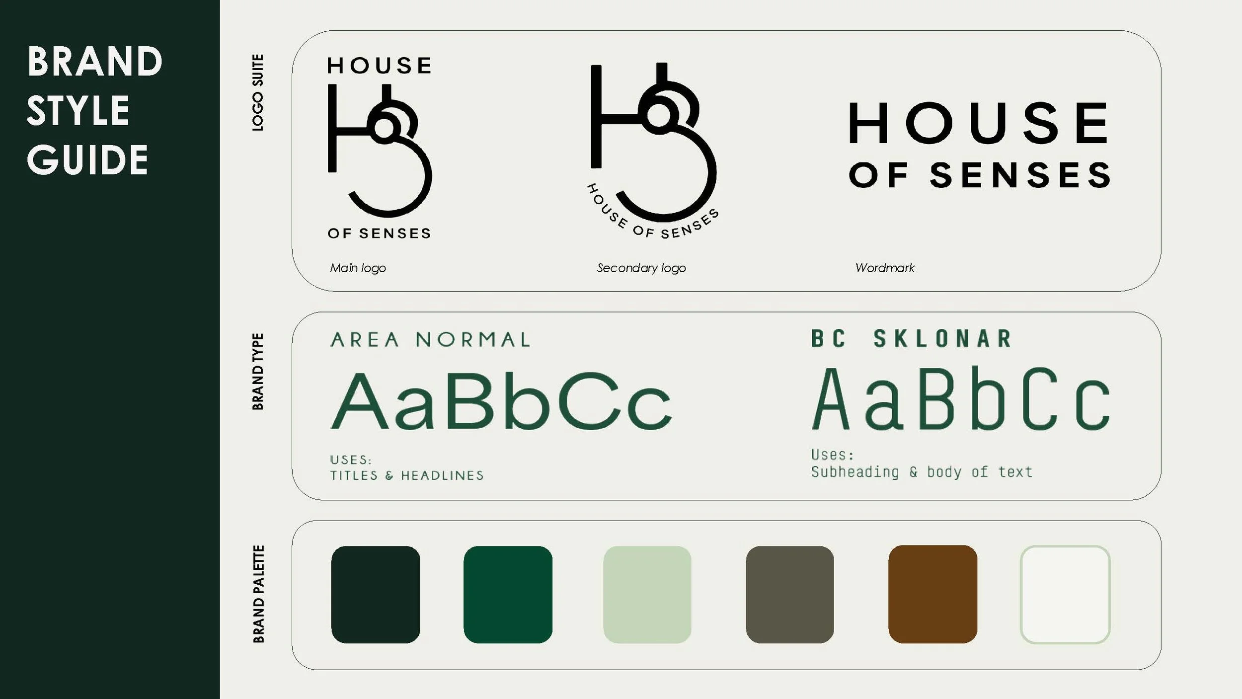
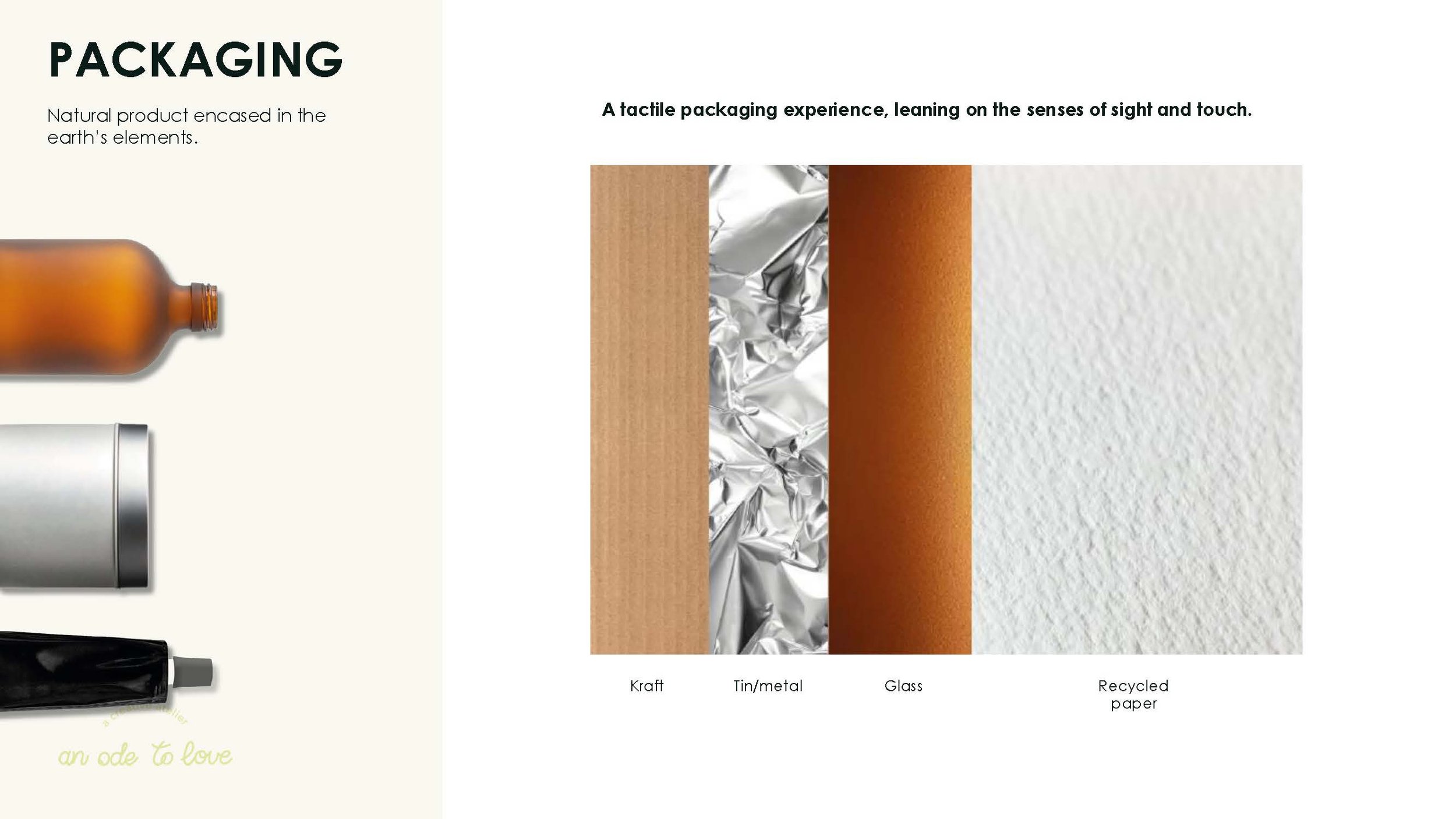
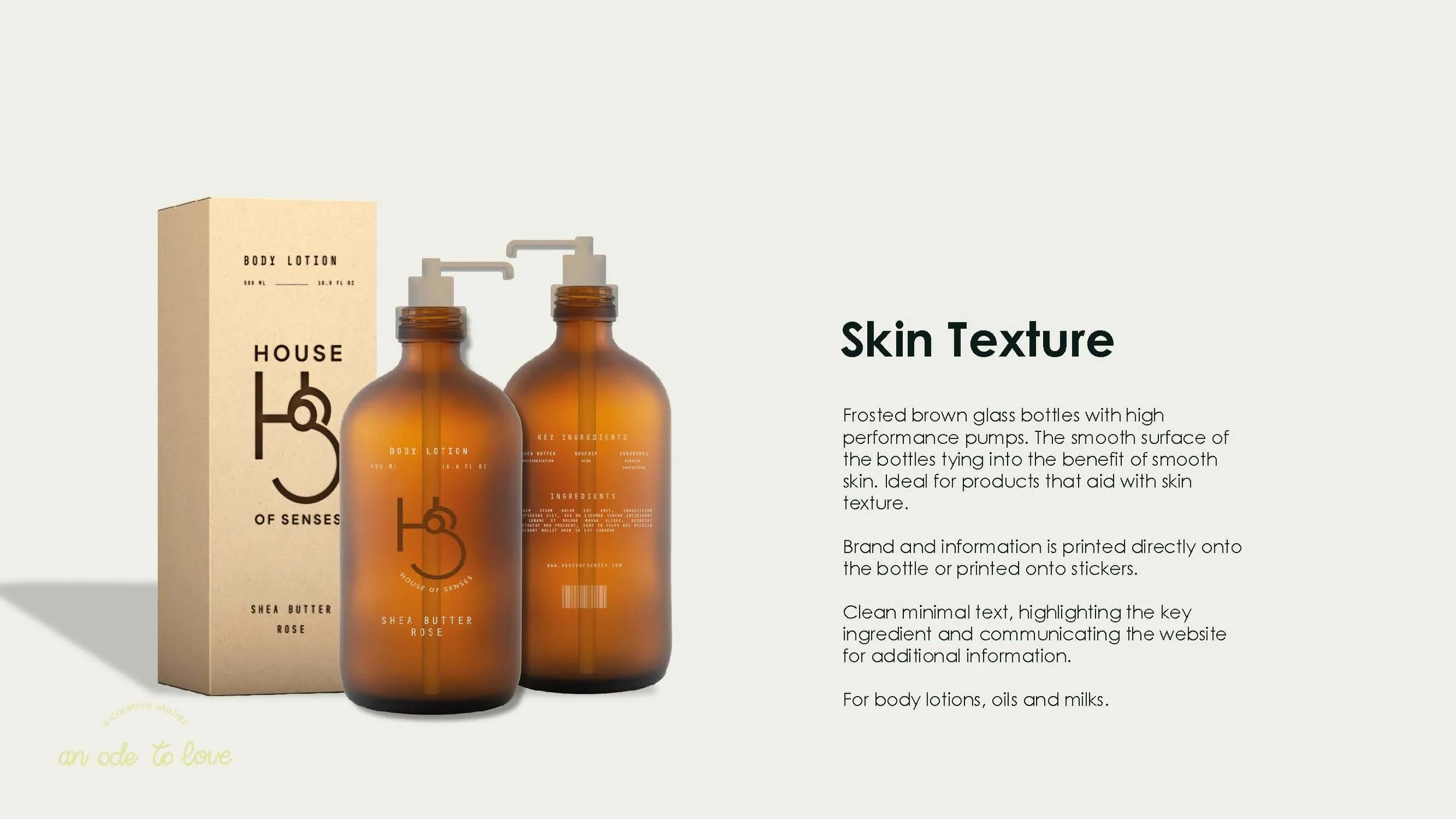
Client Brief Entry
House of Senses.
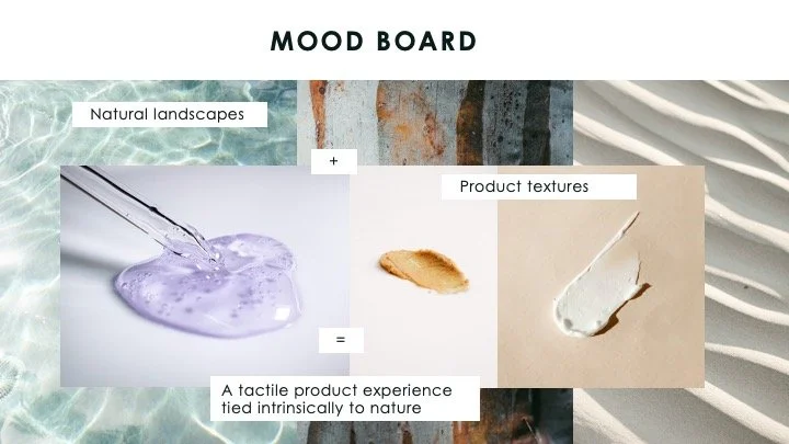
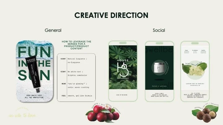
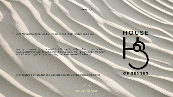
A unisex skincare brand made from the natural world for an indulgent Self Care experience rooted in the senses.
Direction: Warm Minimalism, Australian Natural World, Highlight Senses
Close-up photos of the natural world of Australian represent the aesthetic of the brand direction for a natural skincare brand allowing a focus on the textures of the landscape and tying them to the textures of the product that is based on the 5 senses.
The client's brief for a minimalist unisex logo is captured by the use of san serif font Area Normal. The letters 'H', 'o', and 'S' of the same font are used to create a balanced monogram. In the monogram, the structure of the 'H' and the soft curves of the 'S' represent the unisex aspects of the brand.
A simple and balanced word mark is selected for the brand. While the secondary logo features the wordmark, supported by the brand name in a more relaxed style following the curve of the 'S'.
A summarised style guide for the total brand identity. The brand colour palette is earthy and relies on fresh leafy greens to elevate the storytelling and warm neutrals to ground and accent the brand.
As the core theme of the brand is the 5 senses, a tactile packaging experience serves as a necessary starting point for the product experience. Preference for packaging types that are recyclable or reusable.
Connecting the product benefits to the packaging - the smooth finish of a frosted glass bottle for a skin softening moisturiser.
Connecting the product benefits to the packaging - the cool touch of a metal container for soothing or cooling products
Connecting the product benefits to the packaging - using coloured metal packaging to differentiate the actives and skincare products with targeted benefits.
The anatomy of a House of Senses product label